
Posts

Do we really need Keepfilters in DAX?

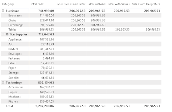
Writing a DAX can be tricky at times and making it efficient for the system is always a challenge for a BI Developer. The most prominent example is the use of filters in DAX. There are zillion ways to filter something in DAX and attain the same result but when you look behind the scenes you will get to know what effect it makes on performance. Looking at the above image it all looks the same. In this blog, we will cover the most common scenarios to use filters including the use of filter with all, filter with values, and keepfilters. I am using the sample superstore data for demonstration. The idea is to get sales for "Tables". The DAX is as follows. The most common and basic approach will be this. Looking at the matrix it gives the sales amount of tables as the total sales for "Furniture". If we use this in a table or matrix results can be perplexing for the user. Considering the total it does make sense. But we want every sub-category to get their respective sales

Power BI Bookmarks- Beginners Guide

Bookmark you heard it right. Power BI provides a functionality to record the state of your page. It is quite similar to creating bookmarks on your internet browser. The good part is it provides a lot of flexibility for both the developer and the user. In this blog, we will cover how to create a bookmark in Power BI and take it to the next level by using of bookmark navigator. This blog is mainly targeting Power BI users who are at the beginners level. Let's get started with the creation of bookmarks. To do so on the top ribbon you need to select View and under it, you can find bookmarks. It will open a separate pane on the side. Before you create the bookmark make sure all the changes are implemented on the page which you want to see in the bookmark. Once the bookmark is created every change you make on the particular page you need to update the bookmark with the help of the three dots available next to the bookmark. Isn't it easy? Let's take it to the next level. I am usin

Rolling Totals vs Running Totals

When working with totals in Power BI running totals and rolling totals are the most common ones used to see trends. It can be confusing at times. This article will cover the purpose of both the totals and how you can create DAX for them? Let's start with the running totals. It is quite similar to Year to Date(YTD). What is YTD? YTD covers all the data points from 1st Jan of the respective year till the recent date. We have a separate DAX that is DatesYTD. But what if you want to do the same but from a year in the past.  We want the total sales where the current date is less than or equal to the maximum date. It will cover all data points in the past. In the below-mentioned image you can see values in the last column for 2012 is actually the sum of sales in 2011 and 2012. Isn't it amazing!! Running totals can help you analyze the trends over a long period of time. In the example, we saw the trend from 2011 to 2014. Let's take a deep dive and analyze the trends for the last 3

Introduction to Slicer Panel

Using slicers is a common practice in Power BI. The positioning and the space it occupies in a dashboard are always in question. I have worked on dashboards where 10-15 slicers are keeping them together on top or side always reduces the space for other visuals. So what can be done? Slicer Panel helps in such scenarios. It is the same as the menu bar on top of different mobile apps. Once you click it expands and shows all the slicers otherwise it collapses and gives you the dashboard for other visuals. In this blog, we will cover how to make a slicer panel step by step. I am considering Sample SuperStore data and I have created a basic dashboard with slicers and other visuals. In the below image, I have put all the slicers on top now we will put all of these slicers into the panel. Protip- As a BI developer I always prefer a drop-down in my slicers because it can be that you have 20 categories or maybe more. I don't want a long list in my slicers. In this dashboard, I will be using

Wrong Totals in Power BI

Yes, you heard it right Power BI still hasn't figured out how to show the correct totals. One of the most common questions in the Power BI community is related to it. So, let's figure out what can you do to correct your totals. I am using Sample Superstore data to start getting rid of the implicit measures that have already been created. I am creating a matrix with categories and sub-categories. Let's include the total sales, total profit, and the total number of orders received (if you are wondering how these measures are created then it's just the sum of sales, profit, and distinct count of order ID respectively). Protip- One of the best practices involves creating a separate table for measures (stand-alone table). In this case, we only have 5 measures but what if you have 70-80 measures all in the fact table. If you critically note the total for sales and quantity sold shows the correct total but if you sum up the total number of orders for furniture it doesn't

Introduction to Calculation Groups

Let's consider a scenario where you have 10 fields and the request is to create all-the-time intelligence measures such as MTD, 3M, QTD, and YTD. So as a BI developer in total, you need 40 measures. What??? A long list of measures doesn't look good to me. So can we avoid it? Absolutely yes we can avoid it using calculation groups. How does calculation group? It is actually available in an external tool called "Tabular Editor". You can download it from here . Let's get our hands dirty. I am creating a table with Category and Total Sales. From time intelligence I need MTD and YTD. You can do it with simple measures but let's try calculation groups. Under external tools, you can find Tabular Editor. Once you open it you can see the tables you are using. To create a calculation group you can right-click on the table and under create you can find the calculation group or you can do the same with the help of the shortcut (Alt+7). I am naming the group Time Intellige

Field Parameters in Power BI

Have you worked with field parameters? Another functionality that Power BI offers is to improve your reports. What does it do for the users? At first, it looks like a button but it helps to toggle between different fields (can be columns or measures). Let's get our hands dirty and start with an example. I am using sample superstore data. The idea is to make a clustered bar chart with profit and sales in it. On the Y axis, I need both category and subcategory. The basic approach will be just to add another level to the Y axis which will act as a drill down. But what if I say you don't need a drill down. Yes, that's possible with the use of field parameters. Let's create one!! Go to the new parameter under modeling. Select the field parameter from there you will get a pop-up window that looks something like this. You can name your parameter and just drag the fields from the respective tables. I need only category and sub-category. Pro tip- If you can't find the field

Tips and tricks for Data Labels

If we talk about the level of detail then data labels can make your visuals stand out and add more context to them. There is a flip side too with them. The most common issue is when you put the data labels it creates a bit of a mess in your visuals and it becomes an intricate task if you consider the readability for the end users. That's not the objective of visualization. Let's consider a use case where we are creating a basic line graph with the evolution of discount percentages over a period. We are considering Sample Superstore data. Also, we have enabled the data labels for the whole series. You can play around with the formatting of your data labels. We can adjust the position, colors, and much more. If you focus on the title of the visual it's dynamic in nature and depends on the selection in the slicer. To know more about dynamic titles you can follow the link . From a visual point of view, the abovementioned visual is not so intuitive in nature.  To make it more in

Dynamic Titles in Power BI

As Power BI users, we use titles for visuals or for pages. But what if I tell you to make the title of your visual more intuitive in nature. Is it possible? Yes, it is think of a scenario you have a slicer and a bar graph on a page. The management requested to make the title on the bar graph dynamic in nature. So let's dig deep into how can we build dynamic titles for your visuals. I am considering Sample Superstore data. The use case is to create a stacked column chart with a slicer of the city on the page. On the X axis, we are taking Category and Sub Category and on the Y axis, we are taking Sales amount. Now, if you see the title of the column chart it's static and doesn't change with the selection in the slicer. To make it dynamic in nature we will create a simple measure. Selected City = "Sales for " & SELECTEDVALUE ( SampleSuperstore [City] , "US" ) The DAX is quite simple in this case if we consider the selected value first we need to specify

Summarize in DAX

Let's consider a situation where you have one big fact table and you need to create several tables out of it using different columns. The most obvious way is to do it in the backend but it can be time-consuming. What if we can do the same in DAX itself without going back to the source. The solution is quite simple and DAX calls it "Summarize".  It's quite evident what this function does from the name. You guessed it right!!!! It gives a summary of the fact table based on your selection of fields. To get a better grasp of this function we will take a couple of use cases. We are considering Sample Superstore data and the only fact table is "SampleSuperstore". I want to explore only the geographical data and associated quantity and profit with every city.  First, we need to create a new table {you can do so by going to Modelling and there in calculations, you can find a new table}. Once you select a new table you have to provide a DAX formula before doing so re