Dynamic Titles in Power BI
As Power BI users, we use titles for visuals or for pages. But what if I tell you to make the title of your visual more intuitive in nature. Is it possible? Yes, it is think of a scenario you have a slicer and a bar graph on a page.
The management requested to make the title on the bar graph dynamic in nature. So let's dig deep into how can we build dynamic titles for your visuals. I am considering Sample Superstore data. The use case is to create a stacked column chart with a slicer of the city on the page. On the X axis, we are taking Category and Sub Category and on the Y axis, we are taking Sales amount. Now, if you see the title of the column chart it's static and doesn't change with the selection in the slicer. To make it dynamic in nature we will create a simple measure.
The DAX is quite simple in this case if we consider the selected value first we need to specify the column name and then we need to specify the alternate result if nothing is selected in the slicer.
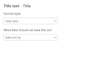
Go to the formatting pane on the right and in the title section of the visual, you can see the conditional formatting. It will take you to a pop-up as mentioned below.
As mentioned in the above image we have selected the measure in the field section. Click on OK and you can see if you select any of the cities it will show the city name in the visual. If you clear the selection in the slicer the title will show "Sales for the US".
Isn't it simple?? Let's take it a step further if someone does multiple selections in the slicer then this measure won't show the right result to do so we need to create another measure.


Comments
Post a Comment