Posts

Showing posts with the label tableau

Difference between sets and groups in tableau

Image
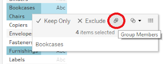
As a tableau enthusiast, I always see similar questions on the tableau community and in today's blog, we will address that. If you are new to tableau then you must be perplexed about the use of groups and sets in tableau. It troubled me a lot in the beginning and after using tableau for a significant period I realized that it's not that difficult and you can identify the purpose after using it. Let's dwell around it and highlight the differences.  Before highlighting the differences we will understand what is a group in tableau? As the name suggested you can group different members into a particular group without any condition associated with it and it will create a new dimension every time. The definition can be confusing at times so let's dig deep into it by taking a closer look at how a group works in the Tableau public. I am using sample superstore data. Before creating a group let's understand the idea behind it. I am taking the subcategory and we are looking t...

Donut and Sunburst chart in Tableau

Image
 Are you bored of using a basic Pie chart in your visualization? Then this blog is for you. In today's blog, we will discuss step-by-step procedures to create a donut chart. Along with the donut chart, there is a much more so stick around. Let's start with a basic donut chart which proves to be the best alternative to the pie chart. A donut chart is a type of Pie chart where the center is carved out so that you display text in the carved-out space.  Pro Tip -: Donut chart can be used to display your KPIs and you can use it to display ratios and percentages. But if you are trying to visualize more than 5 categories try to avoid the donut chart because it will hamper the quality of visualization. The stakeholders expect to see clear visualization where the graphs tell their story by themselves. ( For more pro tips do follow our blog   ) So let's get started!!!! To create the donut chart we are using the sample superstore data and will highlight all the steps from scratch....

How to create tiles map in Tableau?

Image
Are you looking for advancement in basic symbol maps and geographical maps? Then this blog is for you. Tilemaps are the best head away for basic maps because in the latter the shape and sizes of the location play a crucial role. The basic highlight feature of any tilemap is all the regions are represented by the same shape or size. Shapes can vary from circle to hexagon or squares. Such maps play a vital role when the size of the region is not so important for the visualization.  This blog is inspired by one of the Tableau Zen Master. Matt Chamber's work is an inspiration for me and in today's blog, I will highlight the steps to draw tilemaps in Tableau Public. Kindly check out Matt's blog. Our focus is solely on the different states in the US. Tilemaps are a great advantage in such scenarios because there are a lot of smaller states in the US that aren't easy to identify in a standard map. Tilemaps come to the rescue in such cases. Tilemaps cannot be used when we are...

How to create rounded bar chart & lolipop chart in Tableau?

Image
Does your data visualizations are getting mundane? Have you ever wondered why? It can be due to several reasons but the primary reason is using the same graphs and visualization every time. In today's blog, we will look at different options of visualizing bar graphs i.e. rounded bar graphs. If you want to replace bar graphs then a round bar chart is a better option. A round or curved bar chart is quite similar to a basic bar graph but the former uses curve area instead of rectangles. Most data visualization and infographics are using it instead of bar graphs but many experts suggested that curved or round bar graphs can be baffling and imprecise in nature. A curved bar chart has only one dimension i.e. height which is the sole reason for making it complex to read by users. In my opinion, such sort of visualization improves the dashboard and makes it more dynamic in nature. Let's see how to create a curved bar chart in Tableau Public. To create it I am taking the Global Sample S...

Creating parameters in Tableau Public

Image
Let's start today's blog with some questions. Are you greatly indulge in creating data visualization? Do you want to come up with scenarios that aren't available in the data? If yes then this is the blog you really want to read. Parameters allow you to create features or scenarios which help the user to control the data in a much better way. You must be wondering how the users get a better control so mainly parameters allow the user to test different what-if scenarios that aren't available in the dataset. It is like some value that helps you to tailor your visualization according to the dataset. Options where you can use parameters in tableau- use it with calculated field or you can use it by combining with sets. We will look at both aspects in this blog. We can make the parameters more interactive and intuitive in nature by using parameter actions that allow users to change the value just by a click As mentioned, we are considering two basic aspects for creating parame...

Types of LOD expressions in Tableau

Image
Want to take better control of the granularity of your calculations in Tableau? Then you must know the LOD expressions in Tableau. LOD or level of detail is the expression that allows the user to perform simple or complex calculations at different granularity levels. There are mainly three types of LOD expressions depending on the granularity level- Fixed LOD, Include LOD, and Exclude LOD. In this blog, we will use the sample superstore data. Fixed LOD - Such type of LOD only considers the dimensions of your data. Whenever we are forming a LOD expression some dimensions are already present in data but some of them are created or generated by the user. Fixed LOD only considers the user-generated dimensions and not using the dimensions that are already present.  To better understand the fixed LOD we are calculating Profit per day in the different product categories. We will take category and sub-category in the rows and profit per day (calculated field) in the column. Let's play arou...