
Difference between sets and groups in tableau

As a tableau enthusiast, I always see similar questions on the tableau community and in today's blog, we will address that. If you are new to tableau then you must be perplexed about the use of groups and sets in tableau. It troubled me a lot in the beginning and after using tableau for a significant period I realized that it's not that difficult and you can identify the purpose after using it. Let's dwell around it and highlight the differences. 

Before highlighting the differences we will understand what is a group in tableau? As the name suggested you can group different members into a particular group without any condition associated with it and it will create a new dimension every time. The definition can be confusing at times so let's dig deep into it by taking a closer look at how a group works in the Tableau public. I am using sample superstore data. Before creating a group let's understand the idea behind it. I am taking the subcategory and we are looking to create different groups based on their usages such as office supplies and technology. 


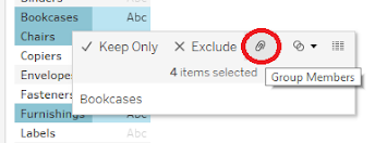
After taking the subcategory in rows you need to select the different categories. To do so you need to hold the CTRL to select multiple subcategories. Once you selected the subcategory either right-click on any of the subcategories or just hover around on the selected subcategory and you will get the option to create a group. You can create different groups based on the usage and you can rename it just by right-clicking on the particular group and you will find the edit alias option where you can rename any group. If you focus on the dimensions you can see every time you create a group it is added to the dimensions.


Let's create an eye-catching visualization with the help of created groups. So we will take the sub-category dimension and sub-category groups that we have created and we are looking to showcase the sales in different subcategories. 


So you have seen the magic that a group can bring to your visualization. Let's move to the sets and we will start by defining what set is? I consider set as an advanced version of the group but in a set, you have a particular condition that needs to be justified, unlike the groups. How does the set function? Let me explain the idea behind the visualization first so we are taking sales and profit in columns and rows respectively. And we will highlight the subcategory with great profits and sales by creating sets. 


You can see in the above-mentioned pictures we are selecting the sub categories which are high on profit and sales. Once you select the subcategories and hover around any one of them you will get an option to create a set as highlighted in the picture. If you select to create sets you will end up in a pop-up where you can see the subcategories which are covered in this set and in this particular condition.

And you have almost created the set and to enhance the quality of your visualization we will do color formatting and we will display all the subcategories which have great profit and sales with green and the rest of all subcategories will be displayed with red. 


There's a lot associated with sets. In this blog, I am touching on the basics of sets. I get super thrilled when I use set in any of my visualizations. Tableau users get confused among sets, groups, bins, and parameters. But if you are using tableau regularly then you can easily distinguish the functionality of each one of them. 


Thanks for Reading  Let's connect on  LinkedIn. For more such blogs do follow us.


Comments

Popular posts from this blog

Identify and Delete Unused Columns & Measures

Heavy dashboards and a bad data model is a nightmare for every BI Developer. Heavy dashboards can be slow due to multiple reasons. It is always advised to stick with best practices. Are you still figuring out about those best practices then you should definitely have a quick read on Best Practice Analyser ( link ). One of the most common issues with slow dashboards is unused columns and unused measures.  It is very normal to load some extra columns and create some test measures in your dashboard but as a part of cleanup process those unused columns and unused measures should be removed. Why we are removing them? Because if you keep them then ultimately it will increase the size of your data model which is not a good practice.  How to identify the culprits (unused columns and unused measures)? In today's blog we will provide you with 2 most common external tools which will help you in identifying the culprits. More external tools😒. Who's going to pay for this? To your surprise...

Copying Bookmarks from one Power BI report to another

Let's think of a scenario, where you want to copy the bookmarks from one report to another. Most obvious approach is to just do a copy paste of the bookmarks. What's wrong with this approach? This approach only works for all visuals but not for bookmarks and field parameters.  If you are not familiar with basics of bookmarks and field parameters do refer to the beginners guide for bookmarks  and introduction to field parameters . Then how do you copy the bookmarks? Power BI enhanced report format (PBIR) for Power BI Project files (PBIP) will help you in achieving this. Let's check it out, I have 2 reports one contains the bookmark called Bookmarks PBIR Test (origin) and other one is Rolling Average PBIR Test (destination) .  Before we get started, you have to enable Power BI Project save option under preview features. Once enabled, restart Power BI desktop. There is a TMDL icon appearing on the left pane. What is TMDL and what's in it for me? There's a lot of possi...

Best Practice Analyser (BPA) Guide

Do you want to save tons of efforts to check if your data model and PBIX file follows the standard best practices and norms? Then this blog is for you. If you are a follower of our channel we already deep dive into the importance of the DAX Studio as an external tool. If you are a beginner I would highly recommend to visit this blog . In today's blog we will check how Tabular Editor can help to optimize the data model.  Best Practice Analyser allows to define or import best practices. It will make sure that we do not violate the best practices while developing a dashboard. Isn't it exciting!! Before we start make sure you already have Tabular Editor version 2.24.1 installed on your system. To install it do visit this link and select the link for windows installer. Once Tabular Editor is installed it will reflect in your PBIX file under external tool. Also, we need to define the standard rules. To do so in your advanced scripting or C# script copy this and save it via Ctrl+S. An...