Description for everything
Just think of a scenario, you are working on a Power BI report that is created by multiple developers and now you are debugging it. If you have no knowledge of the ins and outs of it you will get jaded by it very soon. But what if you see some description or textual information within the report? That will be the ray of light 💡.
As a best practice, if you are creating any report from scratch try to add a description to almost everything. Starting from the tables, columns, measures, calculation groups, field parameters.....
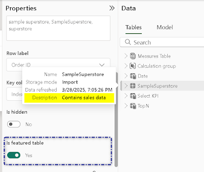
How to do it? Okay, let's start by providing a description of the tables. I am using Sample Superstore data and want to provide a description - Contains sales data. To do so, go to the data model view. Select the table where you need to add the description. Under properties, you can provide a description under the description section.
Easy peasy lemon squeezy!! That's basic and at Analyst in Action, we always strive to go beyond the basic knowledge. Let's take it to the next level, if you scroll a bit you will observe the row label and Key column. What does it mean? The key column is the one that contains a unique value in your table. In my case, I have an Index column but in real-life scenarios, it can be - Order IDs, Product IDs...
If you are an Excel user you can easily tell your row label. Any column that can be identified as a row can act as a row label. If you have selected your key column and row label, and provided a description of a particular table that table can be treated as a featured table. Here is a quick read that will you a glimpse of featured tables.
Once you hit save you will observe, that the Sample Superstore Table is now a featured table. Also, when hovering over the table, you can observe the description is popping up.
Let's move to the next step and provide the description of one of the columns. We will be adding the description to the category column as "represents the category of order". A similar approach to be followed. Go to the data model view, select the category column, and under the properties pane, you can provide the description.
That's one of the approaches, you can do the same with TMDL view and you can use external tools such as Tabular Editor to do the same. What is TMDL? Here is a quick read on the introduction to the TMDL view. This article will provide you with everything you can do with TMDL view. Let's see how we can provide a description in Tabular Editor. FYI, I am using Tabular Editor version 2. Select the column (Segment) and you can provide the description in the highlighted area by double-clicking on it. Hit save and the changes will be reflected in your report.
Protip- To make your report to be more self-service-ready, it is always advisable to provide a user-friendly to all the columns. Either you change it directly in the backend or you can do it in Power BI itself.
One of the fastest and easiest ways to do so, head to the query editor and just double-click on the column header. This will add a step in the applied step pane. The core idea is to provide these names in a single step instead of adding them in different steps. You can double-click on each and every column and change the names.
There are multiple approaches to changing column names but from experience nothing can get simpler than this approach. With a single step, you have renamed all the columns.
How cool is that🤯. Now, let's provide a description of the measures. With measures, you can play around more by providing a comment within the measure and provide a description as well. Let's start by providing a comment, if you create any measure and want to bring life to it commenting is the way to go. Just add "--" and type the text. Some examples of comments are listed below. If you observe closely comments are highlighted in green.
Furniture Sales =CALCULATE ( [Total Sales], 'SampleSuperstore'[Category] = "Furniture" )
-- furniture sales calculated
SUMX (
SampleSuperstore,
IF ( SampleSuperstore[Year_Month] > "201101", [Total Sales] )
)
-- Do not use this combination
To provide the description, you can follow the same approach as we did for tables and columns. Go to the model view. Select the measure and provide the description under the properties pane.
Protip- To make your report, as organized as it can be you can try to group your measures under a folder. To do so, go to the data model view and select all the measures by holding Ctrl. Under properties, provide a name in the display folder.


Comments
Post a Comment