Everything about Paginated Reports
We know all the multitudes of Power BI and how it evolved over the years but have you ever thought what if you do not require all those fancy visuals and features but you need a flat table fitting in a single page and can go on for more than 100s of pages. If you are looking for something like this then Paginated Reports is the answer for you. In today's blog we will pen down everything you need to know about Paginated Reports. To know more about the Paginated Reports do read this interesting article from Microsoft.
Before we start you will require - Report Builder (external tool but a FREE one) and Power BI Pro license along with the contributor rights to publish the paginated reports to different workspaces. Also, we will be working with Sample Superstore dataset. We are aiming to create a paginated report which will look something like this.
Let's get started then, make sure you have published your dashboard in a workspace. For this demo, we have published the dashboard to My Workspace. Do we need to publish it every time? No, you can also make use of datasets available in your system and similar to Power BI you can directly connect to different sources. Once you have the Report Builder installed we will connect to Power BI Semantic Model
Now, we have the datasource connected the next step is to add dataset. This will allow us to copy the queries of a visual in a dashboard and make a similar visual in Report Builder. Let's see how it is done.
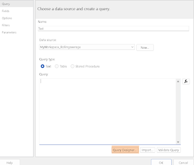
Select the Add dataset that will open a dialog box with different options to navigate but we are mainly interested in Query Design. If you want to know about all options do drop a comment.
Before going to Query Design, we will heading back to our dashboard to get the query of the matrix which contains - Category, Subcategory, Total Sales, Total Sales LY & YoY%. Good part is you can evaluate the performance of different visuals with the help of these queries and DAX Studio. To know more about it do refer this blog where we covered all the basics on how to optimize your DAX.
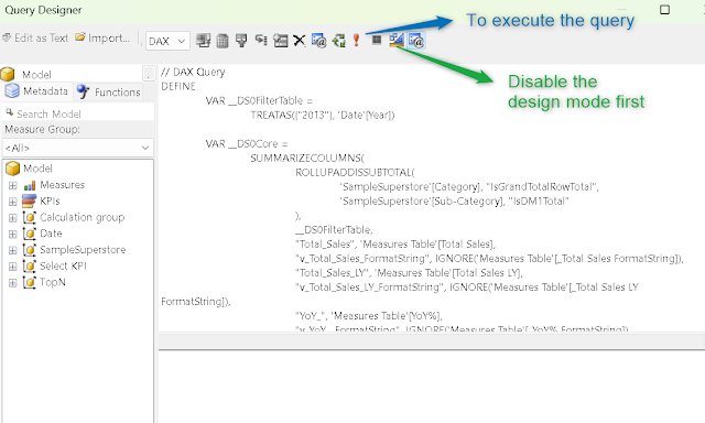
Now, when you have copied the query we will be pasting it in the query designer in Report Builder. Also, disable the design mode first before pasting the query and run the query.
Once the run is completed you will get a preview of all the columns that will be displayed in the big flat table.
When you select OK, you will see all these columns will be added under the Datasets. Now, we have setup the base for the paginated report. It's time to create the matrix in Report Builder. To do so go to Insert (available on top ribbon). You will see different options of visuals for today we will work with Matrix. We will select Matrix Wizard.
Doesn't it look like a Pivot table😜? If you have come across different articles related to report builder then all the authors advised to put all the fields in values. It will work for sure but I would advise to play with different options to figure out why we pulled all fields in values.
For demo, we have pulled all fields in values and if you analyse critically then you will notice we have noticed a few columns similar to excel. We have included the Sample Superstore logo but do note in report builder it only consider JPG format pictures. Last and my favourite is data bars for YoY with a touch of formatting to it. There are tons of possibilities to format your final table.
Now, you have the paginated report ready. Report builder allow to export the paginated report to different formats and most commonly used is PDF. Isn't it amazing? Users found report builder a bit outdated so finally we have an option in Power BI itself to create paginated report. Whattttt🤯
Let's create the paginated report select the "Create Paginated Report" and connect to the dataset (semantic model). We will be using the same Semantic Model.
This will open a similar environment to report builder but quite close to Power BI interface which is bit easier to navigate for users.
We will create the same paginated report that we have created in report builder here. It is just basic drag and drop. Good part is you can see the preview with every change you make.
In my opinion, paginated reports within Power BI will be a lot powerful once there will be a lot more options to insert. Currently, it shows very limited options. Ultimately, it depends on your requirements if you are looking to setup a basic table/matrix then you can go with it. And if you want a table/matrix with more formatting options you can go for Report Builder. Here is the end result we achieved with Paginated Reports in Power BI.
"All our articles are intended to address all the frequently asked questions related to a topic. Do leave a comment if it answers any of your question. "
Thanks for Reading Let's connect on LinkedIn. For more such blogs and pro tips do follow us


Comments
Post a Comment