How to create tiles map in Tableau?
Are you looking for advancement in basic symbol maps and geographical maps? Then this blog is for you. Tilemaps are the best head away for basic maps because in the latter the shape and sizes of the location play a crucial role. The basic highlight feature of any tilemap is all the regions are represented by the same shape or size. Shapes can vary from circle to hexagon or squares. Such maps play a vital role when the size of the region is not so important for the visualization.
This blog is inspired by one of the Tableau Zen Master. Matt Chamber's work is an inspiration for me and in today's blog, I will highlight the steps to draw tilemaps in Tableau Public. Kindly check out Matt's blog.
Our focus is solely on the different states in the US. Tilemaps are a great advantage in such scenarios because there are a lot of smaller states in the US that aren't easy to identify in a standard map. Tilemaps come to the rescue in such cases. Tilemaps cannot be used when we are taking exact locations into account because in tilemaps locations of different states can't be precise (due to the representations with a particular shape).
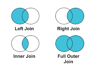
For today's blog, we will take two datasets into account. One is the financial consumer complaints and the other is the data used particularly for tilemaps. The first step is to found a common element to link both datasets. In this case, we are combining by state abbreviations. In financial consumer complaints rename the state with an abbreviation.
After that go to the other data (hex map data) and take rows in rows and columns in columns. Then go to the analysis tab on the top pane and unselect the aggregate measures and you will get the basic outline of the map which has circles in it.
Now go into the shapes present under the marks and select the required shape. I have selected diamond shapes for it. Now the map is almost ready just a few formatting steps away. After that increase, the size of the shape is selected, and change the alignment of the text so that all the abbreviations come under the diamond shape. At last, we will take the count of financial consumer complaints in the color and you will get the desired tilemap.


Comments
Post a Comment